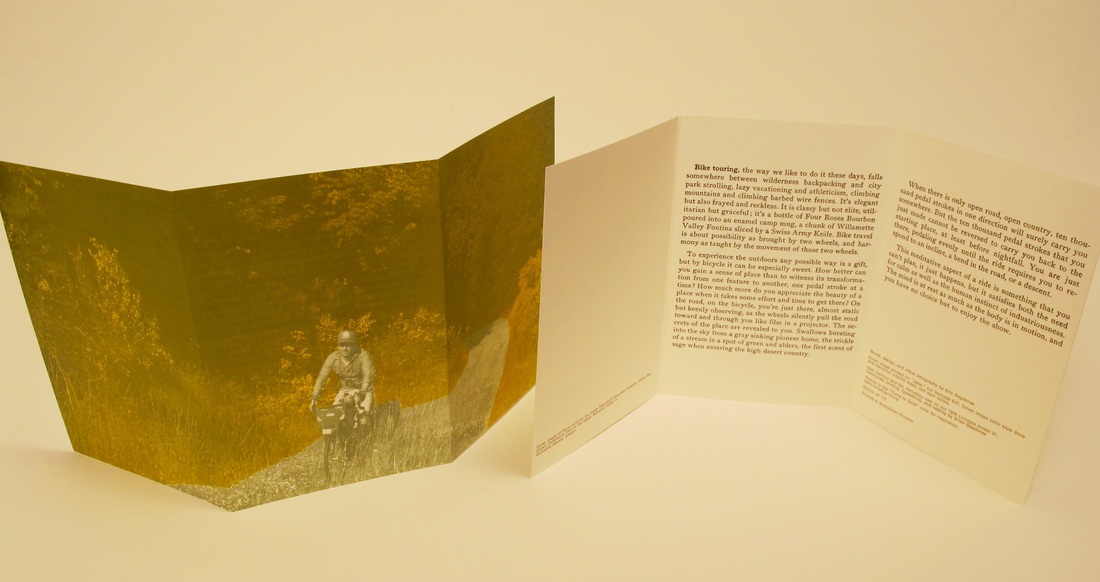
 This project was an exercise in analog printing and design. The print describes the whimsical, utilitarian but graceful character of bicycle travel. A nod to record album art of the early 60s, hand-cut rubylith was used for color separations. Printed offset litho on 100# cover weight linen stock. The text body was cast in Century and Helvetica and was letterpress printed using linotype composed matter. Edition of 172. Printed at Stumptown Printers.
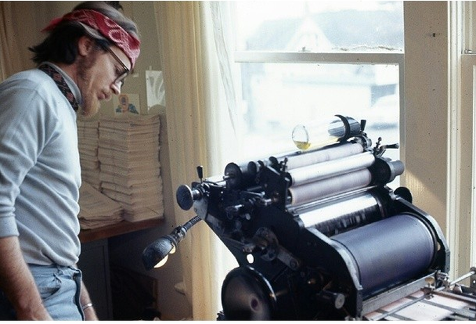 Photo by Roger Steffens/The Family Acid Poet Jerry Burns, editor, publisher, and printer of The Goliards Literary littlemag and Goliards Press. Here he is shown running his Multi, printing "My Favorite Poets," a collection edited by Roger Steffens and published by Goliards Press in 1969. Goliards Press was in operation from 1964 to 1979. The press was based out of Fairhaven, near Bellingham, Washington. Roger Steffens is a writer, poet, actor, and is known widely for his work as an archivist of reggae music. He is also a prolific photographer, and starting from his service in the Vietnam war, he documented many decades of his life through thousands of beautiful photographs. The above photo of Jerry Burns and his press was taken from The Family Acid feed, an amazing collection of Roger Steffens's photo work curated by Kate Steffens. In addition to its online presence, selected photos from the The Family Acid collection have been published as a book of photographs by the same name. I'm grateful that Roger Steffens documented the behind the scenes production of his book, and that the above photo was included in The Family Acid feed, as it provided the inspiration to track down my own copy of "My Favorite Poets" and look into the work of Jerry Burns. Pictured below is the copy of the book that I recently acquired. I wonder if the same book is among those stacked on the table behind Jerry Burns 46 years ago? 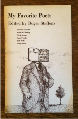 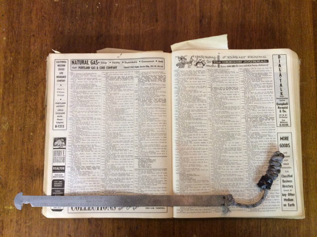
This was an interesting thing that came up at work last week. The story below, was copied from our blog on the Stumptown Printers site, written by Brian.
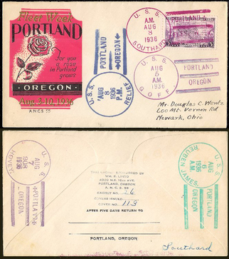
The pica pole pictured above is a piece of Portland, Oregon printing history uncovered recently by Dee of Magpie Messenger Collective. When Dee first came upon this treasure discarded in the street, he recognized it for what it was most recently used for: a "slim jim" (tool for breaking into cars) but what caught his eye was that this tool was crudely fashioned from a printer’s pica stick. It’s an old one, and has a name engraved on it in several places: “WM S LINTO”. Upon referencing old trade journals and an old phone directory that we have here at Stumptown Printers, we discovered that Linto (William) was a prolific local hot-metal era printer born in 1885. He started working in the printing trade at age 19. On top of that, the printer’s tool was supplied to Linto from the Portland American Type Founders office, one of 4 such offices west of the Rocky Mountains during the early twentieth century (Fellow printing geeks will appreciate this - American Type Founders were the King-Daddies of type founding and design for much of the twentieth century). Linto was a compositor at the Oregonian newspaper, but is also known in the world of stamp collectors for his private press work, in particular his printing of cachets. Most of the examples that we could find were of World War II era propaganda (if you search for it, be warned: some of the stuff is a bit over-the-top and can be offensive) but we did find earlier examples of cachets commemorating local events such as the Portland Rose Festival (Pictured Above. The image was lifted from this website). So how did this antique pica pole get into the hands of someone who is more interested in breaking into cars than typography and small press? That’s the mystery. Anyone who has worked in a print shop knows that printer’s pica sticks and line gauges are not to be messed with, once a printer claims his/her pica pole, it stays with them. Printers rely on their own, if they were to use another, they may find their measurements off by a half a point, so it’s best to stick with the tool that they are familiar with. Linto knew this: his name is engraved in 3 places on this pica stick. Undoubtedly he kept this trusty tool close to him, which aided him in creating an estimated excess of 5000 different cachets (source). This American Type Founders pica pole is roughly 75 years old, why did it surface now? The person who was using it as a slim jim was no craftsperson, the conversion is very crude and the “rope work” making up the lanyard is bungled. So I’m guessing that the assumed thief isn’t a former printer looking for a new livelihood. But you gotta hand it to whoever appropriated this printer’s tool. It does appear to be the right size and shape for breaking into cars. Pretty clever. This use of a pica stick is something that has never occurred to us. We had better keep an eye on ours. But the real question is: How would Linto feel about his precious tool being used in this way? Thanks to Dee for sharing this find, and for having fun researching this bit of Portland printing history with us 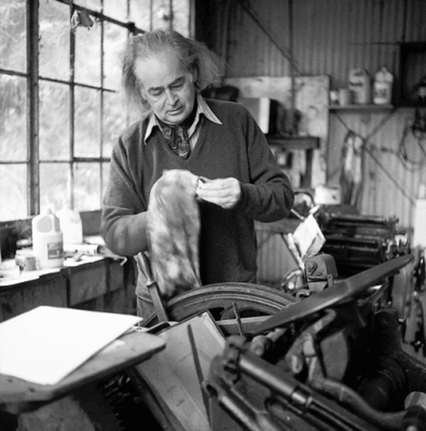 The trusty Multi 1250 can be seen here behind George Hitchcock and his C&P platen press Oregon-born writer, artist and printer George Hitchcock (1914–2010) was a prolific publisher/poet whose work helped shape the small-press revolution of the 1960s. In 1964, he founded Kayak, a literary journal which he edited, printed, and bound himself. Kayak was in publication for 20 years. Kayak, both the journal and publishing imprint, possessed the beauty and fanciful recklessness that is found in many of the best independent publishing endeavors, proving that creativity, frugality, and resourcefulness can overcome budgetary constraints with striking results. Hitchcock's main production press was a 1940s Multi 1250 offset press that he had acquired after it had been retired by the United States Merchant Marine. George Hitchcock's printed work was spontaneous and whimsical. His sometimes percipitous disregard of technical printing standards created its own kind of beauty. On some forms it appears as if he didn't bother with an ink fountain but instead directly inked the rollers, perhaps even replenishing with a different color of ink as the run progressed. The use of split fountain is common throughout the printed work, and starved ink in areas only adds to the charm and reading experience. Each piece, even within a single print edition, is unique, and each of those printed pieces is alive with the story of its production. 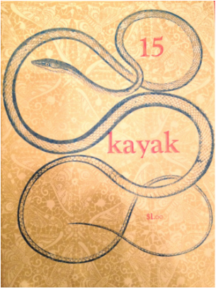  Recently I had the opportunity to spend time at my new favorite bookstore in Portland, Divison Leap. Division Leap has most of the Kayak journals and published works in its collection, as well as a couple original George Hitchcock paintings on display. Seeing all the Kayak work in one place was amazing. The sheer volume of what was produced in Hitchcock's "printing shed" using just a couple of modest but good presses is astounding.
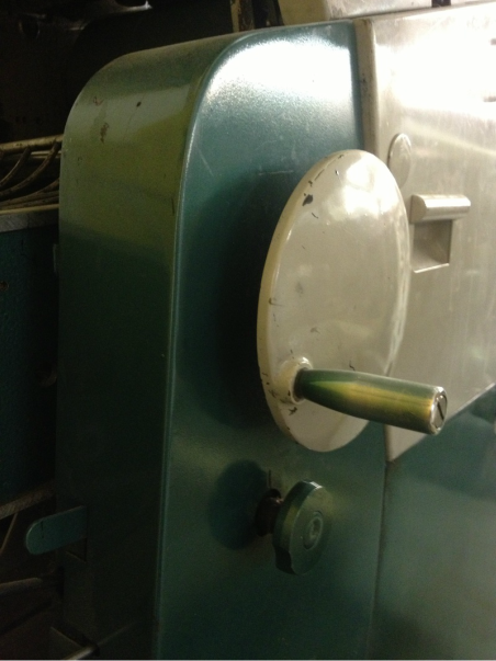
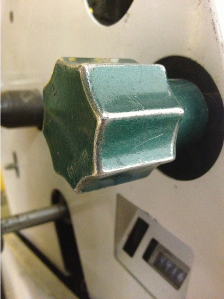
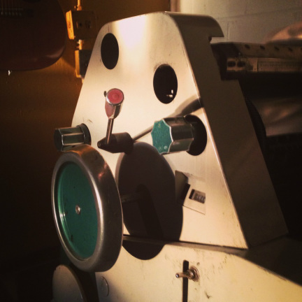
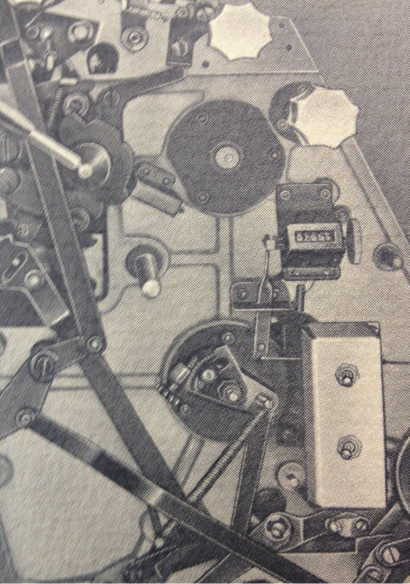
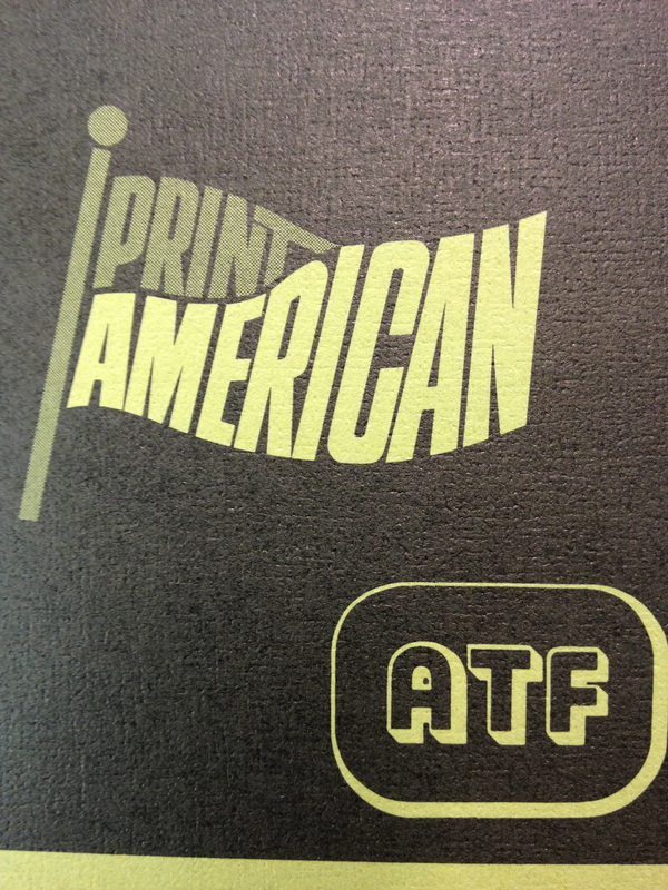
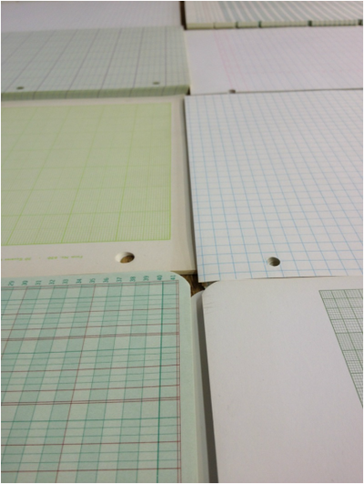
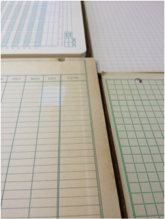
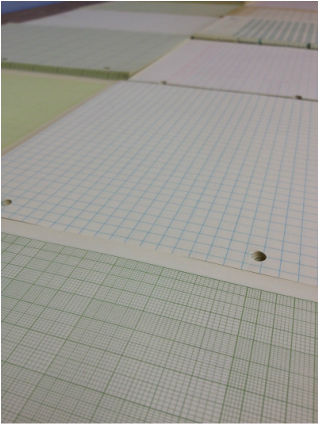
I learned through Jim Carmin, special collections librarian and co-curator of the exhibition Unsinkable Genius: The Surreal Voyage of George Hitchcock & Kayak Magazine, that after Kayak ceased publication in the early 1980s, the Multi 1250 was purchased by poet Robert McDowell. McDowell went on to use the same press to produce many issues of his own literary journal, The Reaper. With all that wonderful work in its history, I wonder what that trusty old Multilith is up to now. 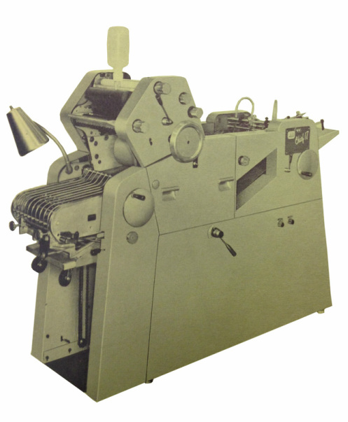 The Chief 17 and 15 presses were a subject of my obsession when I started out as a printer. While working for a printing temp agency I met a couple Chief loyalists on my different jobs. They spoke highly of the versatility and reliability of the machines, bragged about the heroic acts of printing that they performed using Chiefs: CMYK printing one pass at a time and an additional spot color with hairline trap, varnish overlay for a total of six runs, etc. These guys loved that the inking units could be changed easily during a run without washing up; they liked the adjustable headstop bar that allowed one to adjust the angle of approach of the sheet rather than skewing the plate for registration purposes. They talked about ways people had hot-rodded Chiefs by adding a third form rollers to them. And as a bonus, San Diego Printing Parts manufactured aftermarket parts for Chiefs, so there were still plenty of parts to keep these presses going, even well after the graphic equipment division of ATF stopped producing them. However, even the fans did seem to offer some kind of caveat when talking Chief, along the lines of "finicky, but great" or "if you can get to know the personality of the machine, you'll never want to go back to another press." One of my printer friends had based a small job shop operation on a Chief 17, and ran his shop successfully for many years with just the one press. I was surprised upon entering the production area of another commercial print shop to discover four Chiefs there, the primary presses of the operation. The production manager there simply said as explanation, "we're a Chief shop." So when it came time to start a print shop, the first press we bought was a green body Chief 17. Already 30+ years old the press was well used but the price was right, and it served us well for many years. I'd have to say, however, that running that Chief reminded me a little of driving the air-cooled 1969 VW bug I once owned for a short while. You'd have to carry a tool box with you and expect surprises along the way. I was always adjusting the timing, delivery bar gripper fingers, suction feet, and making similar adjustments for each job and type of paper stock, but once that was done and it was set up, it was good to go. Some of my printing mentors achieved a real level of finesse as Chief operators and mechanics. I learned what I could from them, if nothing else a love of that machine. 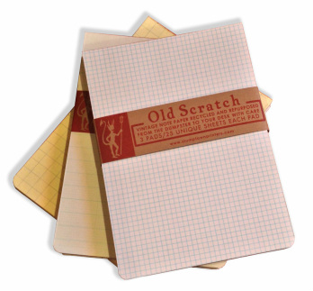 One recent Sunday on our way to the shop, my brother and I came across an estate sale which featured what looked like old stock of a 1950s office supply store. All manner of erasers, binder clips, clipboards, envelope moisteners, boxes of gummed labels, and any imaginable mid-century style office supply specimen was heaped in piles. But mostly there were stacks and stacks of paper. Beautiful vintage ledger, engineering, graph, and lined notebook paper beneath dust, in cardboard boxes, some still shrink wrapped though yellowed with age. All sizes and weights, bound and loose leaf. A tangle of potential. We got the word that most of the paper would be trashed, but didn't have much time to come up with a plan for what to do with it. Due to its condition and inconsistent sizes and weights it wouldn't have been appropriate for a press run. If not for the press, it seemed like we should use it for something. We ended up taking the equivalent of a case or less. After admiring the paper at the shop for a couple weeks, we decided on a design that would preserve the random nature in which the stock was found, show off its variety and color, and give it new function. Scratch pads. With a level of fervor that we imagined Hrabal's protagonist Hanta of "Too Loud of Solitude" would have approved of, we hand collated the paper and arranged it in sets according to color and design, or our own whimsey. Then we cut the paper, padded it, and finished each pad with rounded corners. The name "Old Scratch" was appropriate, so we printed paper bands and chipboard backing sheets with a logo and image referencing the image of "Old Scratch" himself. Each pad features twenty unique sheets of paper, and each set contains three scratch pads. There were a very limited number of sets made, many of which were sent to our friends at Papier Labo, and others that we kept around the shop for note taking. 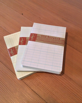 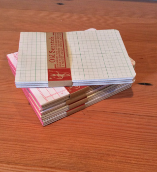 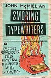 I was excited to recently discover John McMillian's, "Smoking Typewriters: The Sixties Underground Press and the Rise of Alternative Media in America," a book that describes the emergence of small papers & small press magazines and their role in shaping the New Left and forming a political "movement culture" in the late sixties. Not only does the book do an excellent job of describing the cultural contribution of the small press revolution of the 60s, it also got me thinking about the role that the "sub-ton" offset press provided to help democratize print media. That said, from what I've read in the book so far, there is not a whole lot of discussion about specific equipment used or technical aspects of the printing production- that's not the focus of the book. But the writer does touch on how the small offset press was a contributing factor to the growth and proliferation of small press publications and newspapers. McMillian writes, "Before the 1960s, newspaper copy had to be set in hot type on a linotype machine- a procedure that was both costly and difficult. But with the advent of photo-offset printing, newspaper production suddenly became cheap and easy." The above quote is just a glimpse of the long road of improvements of printing technology throughout the 20th century. But it does raise questions about what conditions existed, whether political, social, or technological, that allowed for greater accessibility to printing equipment and ultimately the democratization of the printing process. Photolithography in various forms had been around for 100 years by then, close to the same with offset lithography. Was it the research and development of offset plates through the 30s and 40s that brought presensitized plates into wide commercial circulation that helped build independent publishing momentum? In the early 1900s lithographic shops produced their own plates using their own proprietary recipes for photosensitive coatings which were very laboriously and carefully hand applied to metal plates. The introduction of commercially available presensitized offset plates certainly made it easier for printers, and made it possible for smaller printing plants to operate with less start up cost and less equipment. Was it that the highly disciplined standards of typography and composition were broken, partially through cold-set innovations popularized by equipment like the Varityper? Or was it the more whimsical cultural climate of the 60s that broke those typographical standards? I'm sure the wider availability of smaller format offset presses, like the Multi 1250, helped fuel the independent publishing revolution, as well as many other factors. It is interesting to think about what exactly created that critical mass of self & small publishing activity in the 1960s onward. 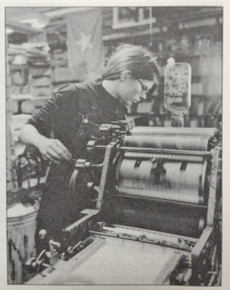 This photo, taken from the book, is of an operator running a Chief 17 at the Liberation News Service 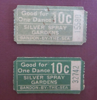 I stumbled across these tickets at an Oregon historical society museum last fall, and thought to snap a photo of them, something I've been trying to do more often when I see interesting printed ephemera while visiting these wonderful little museums. It's a reminder of the importance of the printed piece. Even when printing becomes the detritus of everyday life it serves to tie our lives, experiences and activities to a string of human history. A dance ticket stub, bus transfer, postcard, tradesman association or union card becomes a point on the map of an individual's life. These days we're lucky if a community makes the effort to preserve its historic grange hall or community dance hall from those times in which these structures were the center of American social life. These buildings, once quaking with life, provided refuge for young folks from societal restrictions and older folks from the rigor of the work day; they housed secrets and celebrations, where revelers began new branches of family trees or just caught up with the news from the neighbors. Many of these halls have been completely wiped from history by fire, decay, new development, etc. Often times it's the printed pieces that remain to tell the story, as is the case of the tickets pictured above. The tickets, printed in the 1920s and still with us nearly 100 years later, demonstrate the role that the printer played in telling that story of these lives and communities. Here in Portland we have the Every Sunday Square Dance, which is a weekly community dance held at the historic Village Ballroom. What a perfect opportunity to use the inspiration of the Silver Spray Gardens tickets to print some tickets for this volunteer-run event. I came up with what is pictured bellow. Offset printed on utility grade #110 index using two spot colors, the tickets were also mechanically numbered on a platen press, and then die-cut using a custom die for this job. 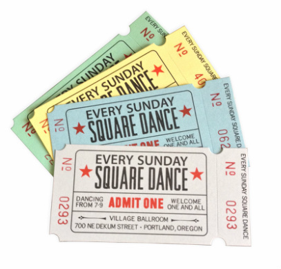 Every Sunday Square Dance tickets design inspired by early community dance hall tickets  I've always been wary of using the term "duplicator" to describe small presses. By their very nature, all printing presses duplicate things, so the term doesn't offer much in the way of class distinction or describe a machine's capability. Nonetheless, small format offset machines have suffered a bit of an identity crisis since their introduction to the market in the late 1930s.
Sheet size was frequently used to draw the line between the "duplicator" class offset machine and actual printing press. Any machine that could accommodate a sheet size over 10" x 15" fell into the printing press category, and below that resided the duplicators. This was a little confusing, as small offset machines were originally built with common office form sheet sizes in mind, but those same press models were modified by manufacturers over the years to accommodate larger press sheet sizes and a greater variety of job work. There were other features of smaller offset presses that were used by some to define the class. If instead of utilizing constant bearer pressure between cylinders, the machine featured spring loaded cylinders, the press was considered a duplicator or "small format" press. If the machine had fewer than three inking form rollers, the press was considered small format, and so on. Printing historian Fred Roblin, in The November 1965 anniversary issue of The American Pressman, presented this name problem more eloquently and succinctly than is done here, and concluded that "regardless of the name ascribed to it, the duplicator is generally an offset press, embodying a feeder, a planographic plate, an indirect print on a rotary unit with inking and dampening systems, and a delivery." 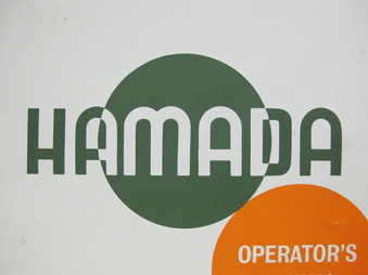 The above image is taken from the cover of a manual for Hamada's 500/600 series presses, published in 1974. One of the interesting things about this manual is that it was printed entirely on a Hamada 550! Now that's walking the talk. This is also a great example of manual, pre-digital graphic design, using two simple but striking spot colors.
When I come across old operator's manuals like this I like to snatch them up if I have the opportunity to do so, even if I'm not currently running the machine described within. You never know when you might meet a printer who needs just that manual- then it becomes a fantastic gift! One of the ideas for this blog is to scan all the manuals I've collected and post them as free downloadable PDFs. In time, I suppose. |