|
The Printing and Small Press section of this site is no longer current and is present only as an archive for informational purposes. Following is the original description of the blog.
Sub-Ton is a personal blog about the art and culture of small press printing and design. I've always thought of the small format offset press as a prefect symbol of self-reliance, independence, and unlimited freedom of expression. Manageable size, cost, and powerful capability have allowed these machines to transform almost any space into literary or art publishing houses, job shops, or manufacturing plants. Even on a humble budget the "power of the press" is accessible through these machines and it's wrapped up in a compact package, a marvel of mechanical systems beautifully synchronized within in a tidy footprint. Zine, chapbook, and 7" record jacket work introduced me to the tradition of small format offset printing. Through these projects I met printers who very skillfully (and/or creatively) used Multilith, Hamada, Heidelberg, AB Dick, Chief, and Davidson presses to produce amazing work. These folks inspired me to become a printer in the 1990s. I hope this blog will serve to celebrate the "sub-ton" offset press and the micro-manufacturing spirit, maybe recognize some of the cultural and social contributions of this printing tradition, and document some of the stories of the printers who have made these presses a part of their lives. I'd love to hear from you if you have printing stories to share or any other ideas for this blog. There's an email button at the top of this page or you can feel free to contact me here: Stumptown Printers Happy printing! Eric Bagdonas I will no longer be able to furnish copies of press & equipment technical manuals, nor provide troubleshooting/repair advice about printing equipment. Lately the demand for both has been much higher than I can handle with the limited time and resources that I have. Printing and vintage printing equipment remains a hobby of mine, but since I’ve entered a new career field I haven’t had the time (or head space) to commit as much time as I’d like to hobbies, unfortunately.
Thanks to everyone that I’ve had the pleasure of brainstorming or exchanging ideas with about printing, small press challenges, and clever solutions over the years! -Eric 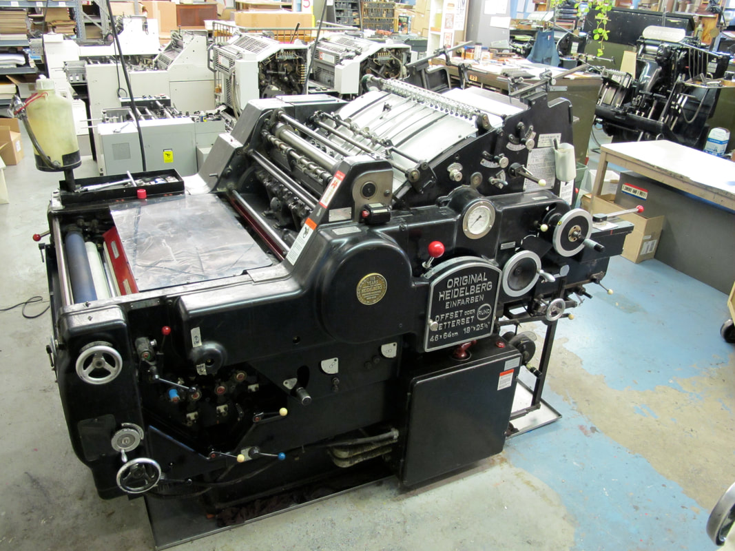 Stumptown Printers is relocating from our current shop space in Portland. We’ve had a good 20 years in this town. But with our lease expiring this year and commercial (and residential) property leasing rates climbing as high as they have recently, it is unrealistic for us to continue our work here in Portland. The good news: We've located a new shop space just outside of Portland and will be relocating in the next couple of months. We're excited to get to work in a new location starting the first of the year. The bad news (for us): Our new shop space is smaller than our current one, and we need to find new homes for some of our equipment. Heidelberg KORD 64 I’m going to be sad to see this press go. Of the 20 years that we’ve been in business, this has been my favorite offset litho press that we’ve had on our floor, hands down. The swing gripper system, convex feed board with positive sheet transfer provides excellent registration. It can be run bearer to bearer, or variable/adjustable impression pressure. The construction of the solid iron frame provides what Heidelberg calls “no vibration” accuracy and consistency. It’s a beauty. We’ve printed most of our LP jacket work on this machine, from single spot color to CMYK. Oversized posters, oddball packaging jobs, hairline 5 color spot jobs on 18 pt. folding board. If you work hard for this machine, it’ll work hard back. The offset K-lines were introduced in the early 1960s, with operating controls and a format that look very similar to the Heidelberg cylinder letterpress machines. Ours is a 1968. It’s in great condition, and is a pleasure to run. We’re asking $7,500 for the press. It comes with tools, spare blankets, all the manuals, and a dampening roller cleaning machine if you need it. If you have any questions, let me know through the contact link above, or email Stumptown Printers. -Eric Heidelberg KORD 64 black body/short box model. Conventional Dampening Year 1968 Max sheet size: 18.125” x 25.25” 4 form rollers Weight: 5,850 lbs Length: 7’2” Height: 4’8” Power: 3ph/ 4.0 kW/5.5 hp 
Over the years I’ve been happy to share small offset press manuals (at least the ones that I’ve had a chance to convert to PDF) that I have kicking around the shop. Lately the demand has been much higher than I can handle, and I haven’t been able to get to all of your requests. I apologize for this. This is something I do in my spare time (of which there is very little these days) and with my own resources (which are limited).
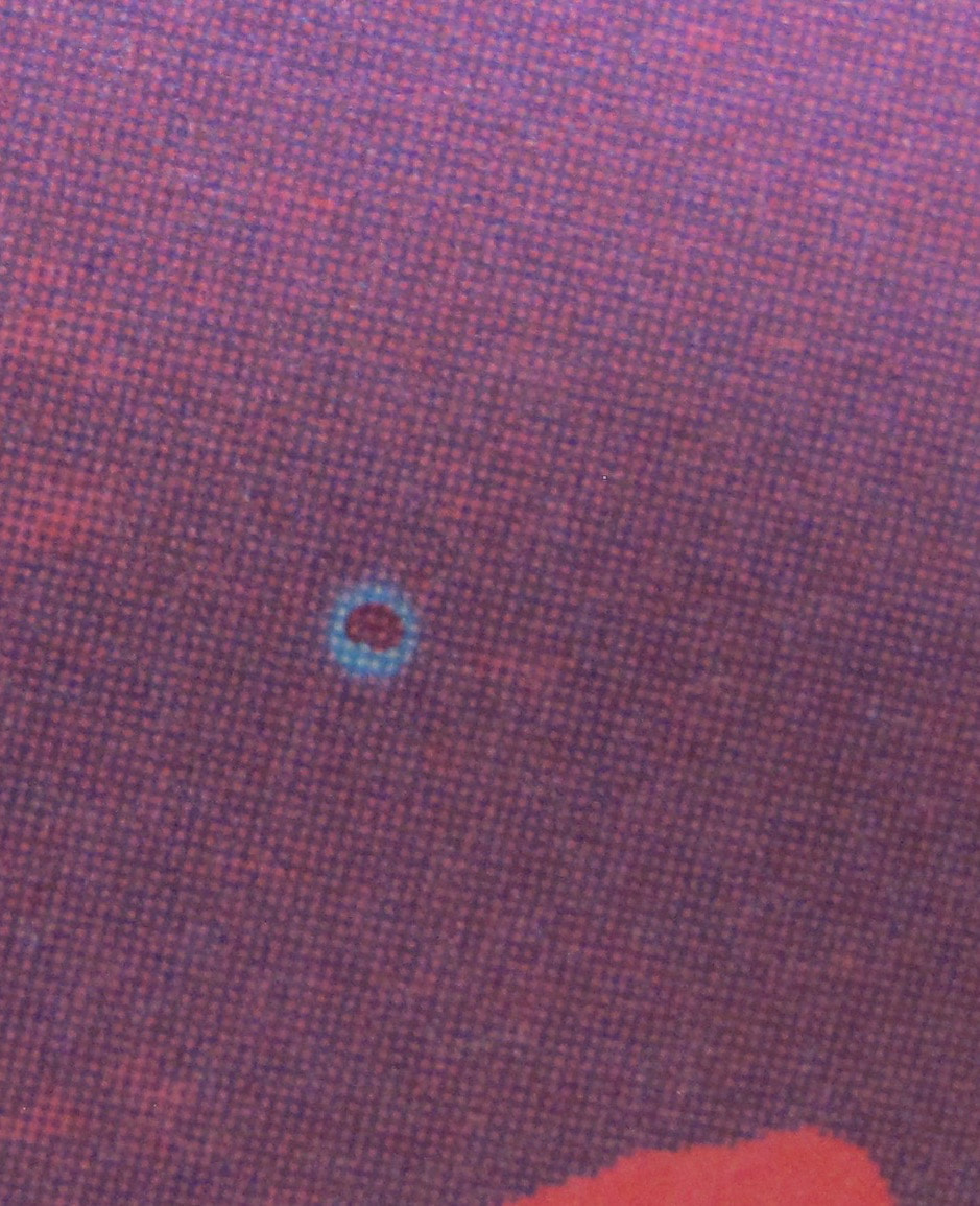
If you need a manual for a particular press and think I might have a copy of it, I still want to help if I can. Email me a request through the “contact” link, above, and I’ll see what I can do. I WILL NOT RESPOND TO BLOG COMMENTS requesting manuals. And I likely won’t respond to emails if you don’t at least provide your name and maybe a little context for what you're looking for. As always, let me know if you've got manuals for small presses & equipment that you'd like to share so that I can make them available here. Thanks! For as long as the venerable art and practice of putting ink on paper has existed, there has been the scourge of the hickey. This printing blemish has created mountains of spoilage, desecrated works of art and dishonored portraits of the honorable. It has spawned untold towers of ruined paper stacked to the moon and back many times over, stolen weekends and been responsible for a million sleepless nights. It has certainly destroyed careers, and at its most benign, the hickey has caused pressrooms to rumble under torrents of profanity.
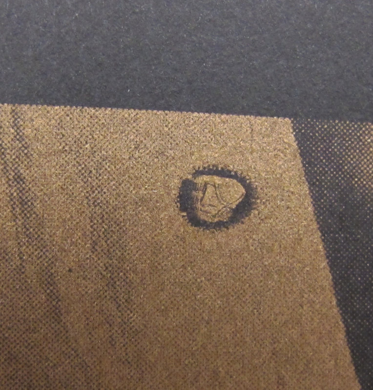
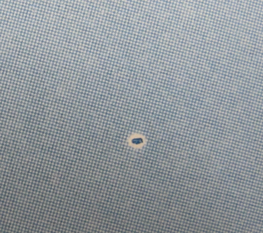
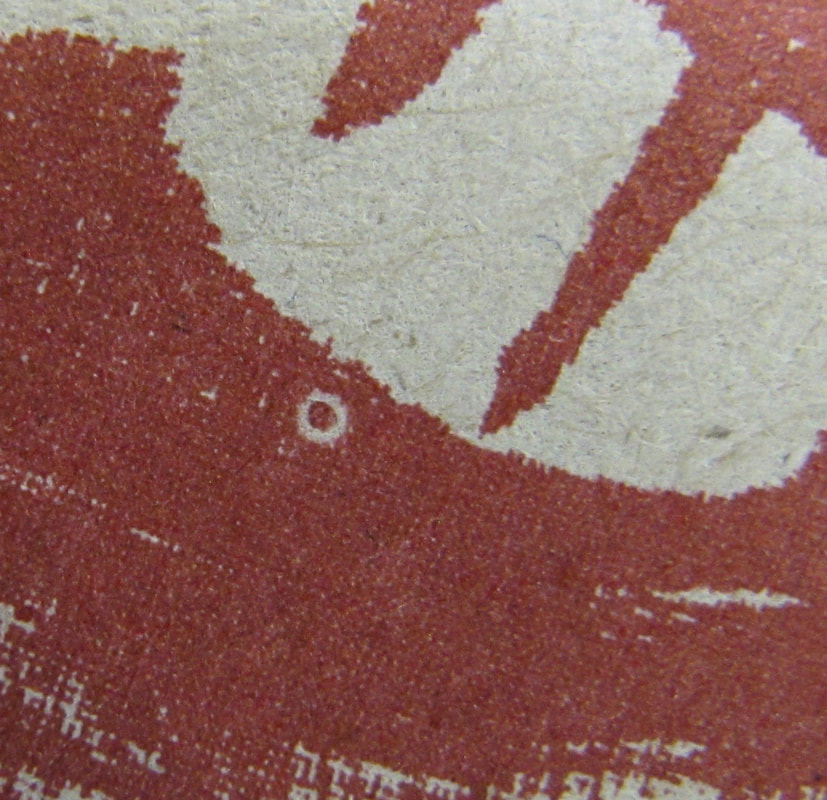
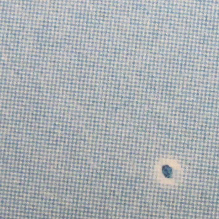
And it’s just a dot. But depending on how or where it appears, a very unfortunate and unlucky dot. A hickey, at least in the context of printing, is a spot or defect in the printed image derived from dust, dried ink particles, separated paper fiber, or other foreign particles that adhere to the blanket, plate, or print matter. It is a bit of crud that gets in between the printed sheet and the print form and is most evident in solids and halftones. Within the taxonomy of hickies, the classic form is a “donut hickey.” Appearing as a solid dot with a blank ring or halo around it, these ring-shaped hickies, also called fish eyes, bullseyes, the devil’s a-hole, or a million more colorful names thought up by printers through history, are perhaps the most recognizable. Also common are “void hickies,” which appear as blank dots, or specs within a printed area. Here at our shop we find that of the two most common hickey sources, ink particles and paper particles, paper is to blame 80% of the time. And if that paper stock has been back trimmed with a dull blade or beveled side of the knife, fibers are forcibly dislodged instead of neatly cut, leaving a fuzzy, furry edge. Hickey heaven. Another culprit: ink tack. If the ink tack is stronger than the cohesive or binding strength of coating or fiber of the stock, pick-outs occur. These might start out as the classic donut hickey, but if the ruptured paper fiber piece becomes saturated with water and less ink receptive, it will print as a void. It is always interesting to thumb through a lift of printing and do some detective work to find a source of a hickey, and observe how it changed through a run. Often you can find the origin point within the printed sheets. While thumbing through the lift, you may see that the hickey grows in size, or recedes, disappears, or moves to another area of the image. There may be one, or many, making up a galaxy of hickies in a single image. Then you’re in trouble. However, over time and as digital reproduction spills forth in areas formally occupied by traditional print, we’ve felt that the hickey has elevated a bit from its status of pure pressroom menace to that of something of a mark of authenticity. Its spontaneity of occurrence, unique shape and form in every instance of its appearance, and the life arc during a run makes it the wabi sabi of a particular printed work. Don’t get me wrong. We’ll absolutely stop the presses for hickies, keep a keen eye on pull sheets for those characteristic bullseyes, and do our due diligence to avoid them. But now when viewing print ephemera- old show posters, little mag-era independent publishing, and record jackets from the 60s and 70s, the occasional hickey may just enhance the enjoyment of the piece. It reveals the subtext of the print process, communicates a different life separate but parallel to the graphic intent of the artwork. Someone worked hard to bring the printed piece to life, working over whirling machinery and the hiss of ink on rollers. The hickey: scourge, seal of authenticity of real ink on real paper. And depending on where it appears, beauty mark. 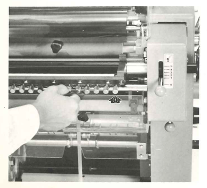 Newly PDF’d, a Ryobi 2700/2800 manual. The 2700 and 2800 are direct feed machines, very similar to format and operation of the classic AB Dick 360s.
One of the things that I really wanted to do when starting this blog was to digitize small offset press operator’s manuals and resource materials and make them available for download on this site. There are limited resources for small offset press repair and operator’s manuals, especially for free. Having access to such materials can sometimes mean the difference between a press that continues to run and produce good work and one that remains forgotten, buried in the corner of a shop, or worse yet- scrapped. I have converted a handful of manuals to PDF, but haven’t yet found a tidy way in which to share them. For now I’ll post new blogs about manuals as I acquire them and have a chance to convert them to PDF files. If you see any that you’re interested in, PLEASE EMAIL me a request. I’ll do what I can do to get you a copy. I’d like to build the number and variety of PDF documents and am always on the lookout for small offset press manuals, resource books, and ephemera. I’d greatly appreciate any donations of materials, or loans of books if you’d like to help with this effort. 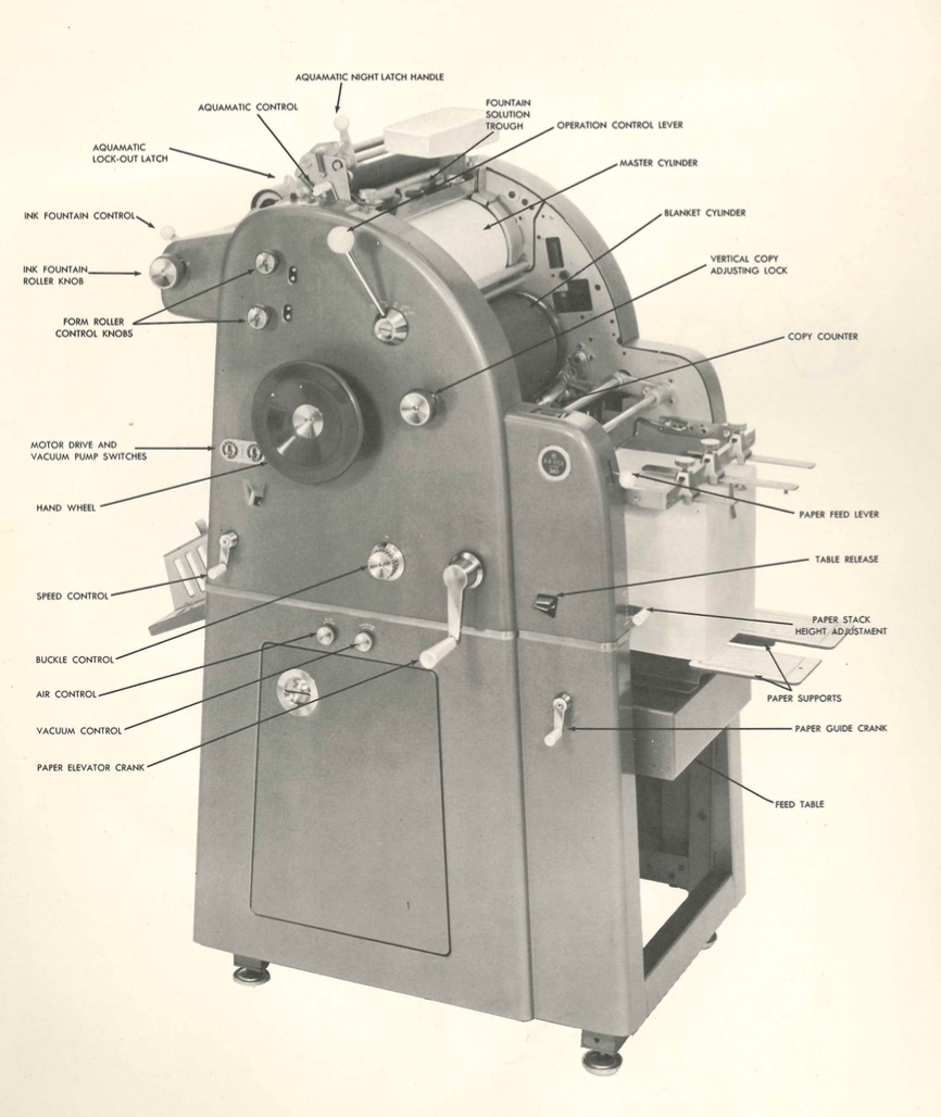 1973 operator's manual for AB Dick 350/360.
 One of the things that I really wanted to do when starting this blog was to digitize small offset press operator’s manuals and resource materials and make them available for download on this site. There are limited resources for small offset press repair and operator’s manuals, especially for free. Having access to such materials can sometimes mean the difference between a press that continues to run and produce good work and one that remains forgotten, buried in the corner of a shop, or worse yet- scrapped.
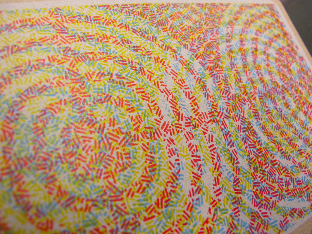
And now it’s been five years. Yes, I have converted a handful of manuals to PDF, but haven’t yet found a tidy way in which to share them. For now I’ll post new blogs about manuals as I acquire them and have a chance to convert them to PDF files. If you see any that you’re interested in, drop me a note by email and I’ll see if I can send one to you. I’d like to build the number and variety of PDF documents and am always on the lookout for small offset press manuals, resource books, and ephemera. This American Type Founders Chief 15 Instruction Manual is from 1966. Email me if you'd like to see it. 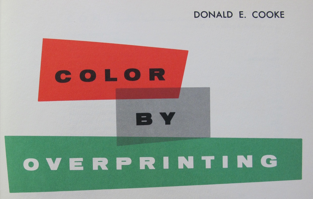 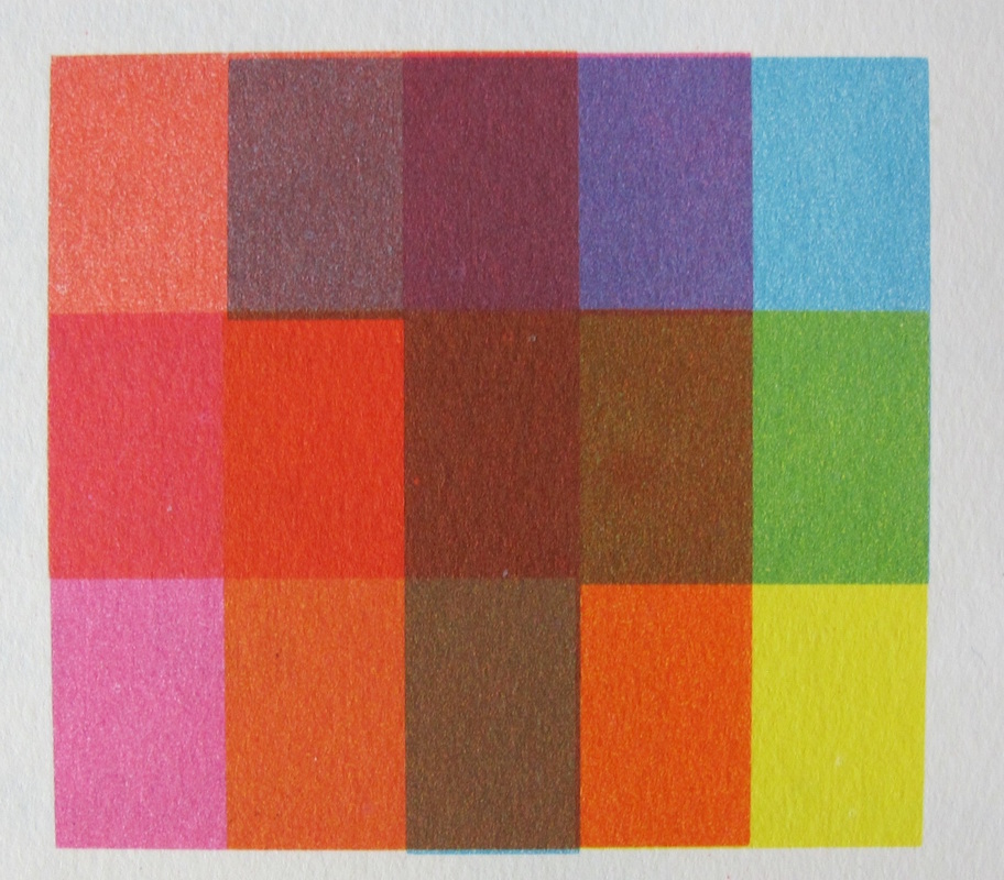 Published in 1955, Donald E. Cook’s Color By Overprinting is a complete guidebook in the art of overprinting spot color (line art) inks in multiple combinations. Most offset litho and letterpress printing inks are transparent in quality. One transparent color overprinted onto another transparent color produces secondary hues where the two colors overlap. This is the essence of color by overprinting. The book certainly does accomplish the goal of creating science out of guess work and is a useful and meticulously organized print tool. It allows printers to preview the overprint characteristics of colors before even inking up, and gives designers working in spot color a real life print specimen in which to gauge overprint effects. Even today, this simply can’t be done digitally. The book features eleven basic colors from which, when grouped in various combinations of tricolor sets, produce hundreds of secondary colors. Color By Overprinting is organized in an index of colors of warm, intermediate, and cool color groups. Page by page, each color group is demonstrated with overprints of all possible combinations of the eleven basic colors. 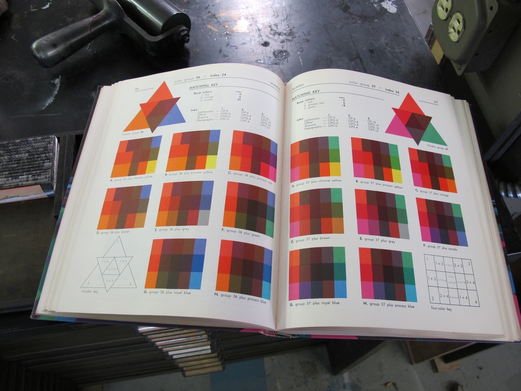 It is interesting that for such an exacting work, the writer introduces a bit of whimsy by challenging the prevailing norm (in 1955) of commercial print and the role of the printer. Cooke himself was an artist and illustrator as well as a disciplined technician. He makes the point that print technology had evolved so far by that point that it had been removed from the field of art entirely. He presents a counterpoint by stating that the printing press itself should be regarded as an artist’s tool, not just a reproduction machine. There is considerable machinery between and artist and the press sheet, yet fundamentally, it is no different from using a brush, pen, or pencil. Between the artist and his or her paper or canvas there is always a tool of some sort. Cooke writes, “If we have made mistakes, with all our miraculous inventions, perhaps the greatest has been a preoccupation with facsimile reproduction. In effort to match, down to the most subtle shade… color printing has channeled itself down a dead end alley. Too many printers, engravers, and artists have lost sight of the simple fact that what pleases the eye may not please the soul of the technician, or vice versa.” 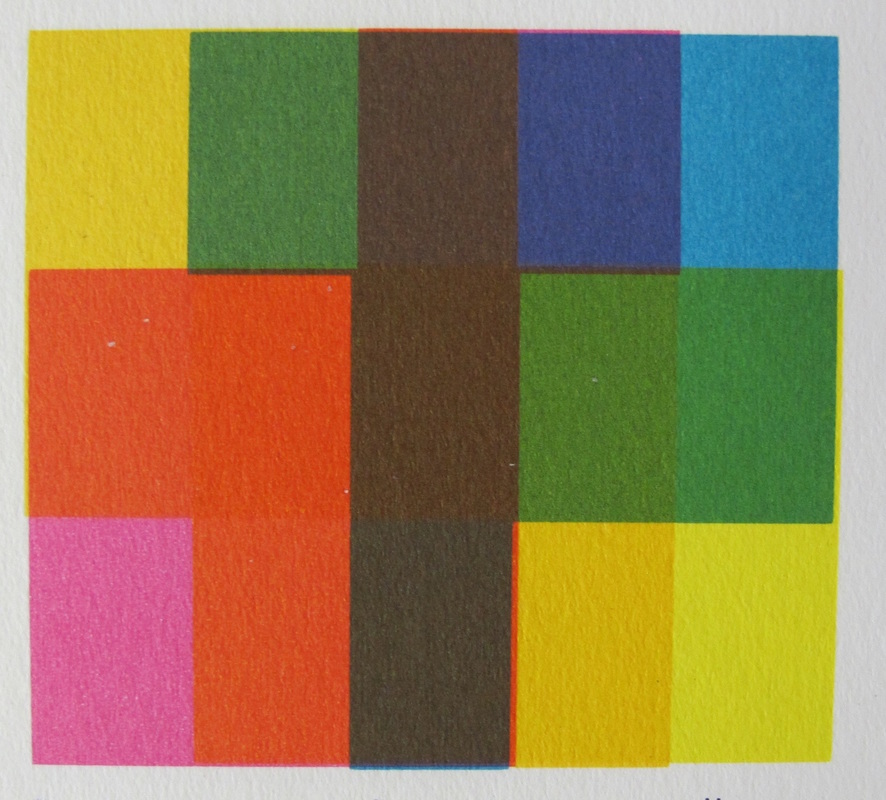 Color By Overprinting itself is an incredible example of mid-century print work. All colors featured in illustrations and color swatches are actual spot colors, not the less expensive to produce process color. Typographical composition is done by Linotype and repro proof, as well as Intertype cold type. It is truly a beautiful printed piece, but also an incredible tool for fans and printers of real ink and spot color.
|